We had to start by designing a unique logo that encapsulated the town’s spirit, history, and values. During the concept phase, we wanted to make sure the streets were more vibrant and inviting for residents and visitors. So while we were sketching logo and icon ideas, we also picked out a range of colors early on in the process that could work during any season of the year.
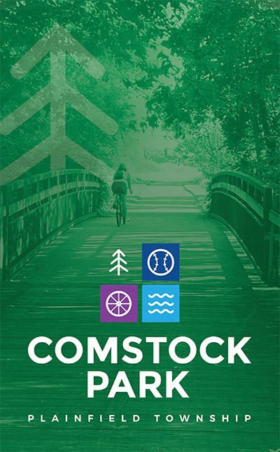
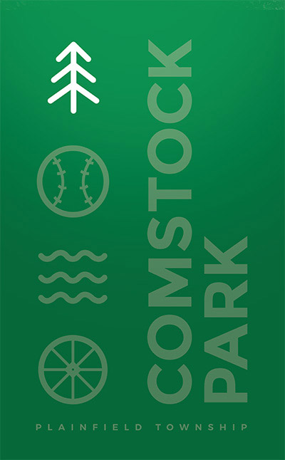
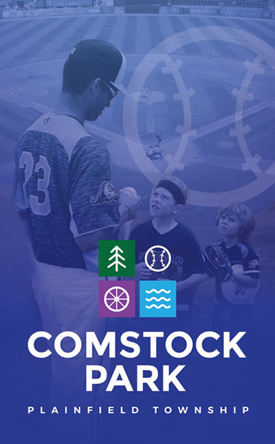
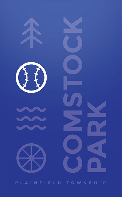
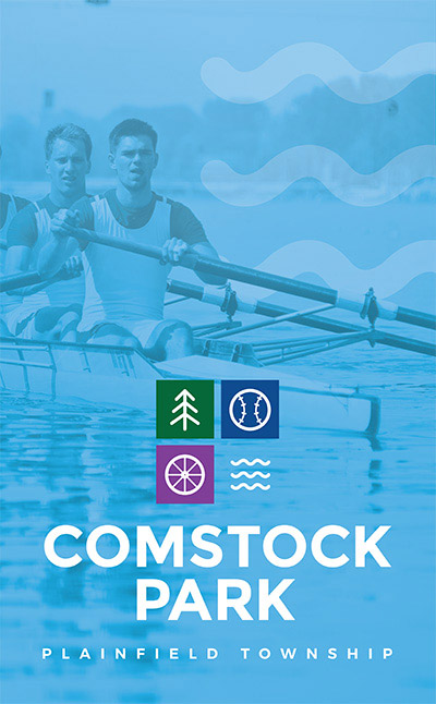
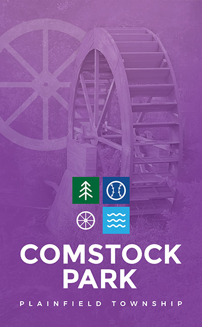
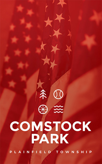
The logo itself is a representation of a window-like organization, featuring four symbols that represent key elements of the town: A tree representing the White Pine Trail, a baseball for the Whitecaps Baseball Team, a mill for downtown historic mill, and a river for the Grand River Rowing Team. Each symbol is thoughtfully designed to highlight the rich heritage and natural beauty of Comstock Park.
Celebrating the town's love for the white pine trail, the White Caps, the Grand River, and the historic mill downtown.
Our goal was to capture the essence of Comstock Park in a design that is both visually appealing and meaningful. The banners are designed to be eye-catching, with vibrant colors and clear symbols that reflect the town’s character and values. Incorporating the USA flag into the design was essential to highlight the town’s patriotism and unity. We used a fifth color to seamlessly integrate the flag, adding a touch of national pride to the banners. This element underscores the community’s respect for the country and its values.
We ensured the design was cohesive, with a harmonious blend of colors and symbols that could be used all year.
Ensuring the design was cohesive, with blends of colors and icons that would look good during any season of the year.
Abby and Tyler not only revitalized my branding, but also crafted a stunning website that captures the essence of my company